Specialists in fine British cloth, Harrisons was set up over two hundred years ago. This quintessential English brand has a beautiful story and rich heritage, yet their website was outdated. So they briefed us to craft a new, bespoke site tailored to the specific needs of the brand. And the result did not disappoint. We introduced innovative design, clever coding and developed a user-friendly platform to bring Harrisons’ history and incredible cloth range to life.
Out with the old, in with the easy
Harrisons has a portfolio of six sub-brands, all showcased on one single website. But while it was handy to have this huge selection of cloth traders in the same place, it meant the navigation and layout had become confusing. The look and feel of the site needed freshening up and the overloaded platform was difficult to update.
With all this in mind, we kicked off by dissecting the current site and exploring the best way to approach the project. We analysed insights and assessed the current tech to see where improvements could be made. From there, it was decided that the priority was to focus on the look, feel and usability of the platform first, before introducing ecommerce as a separate project in the future.
Building back the heritage
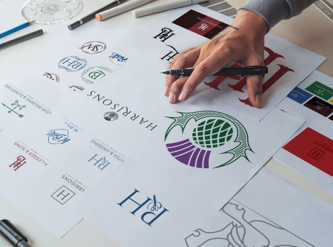
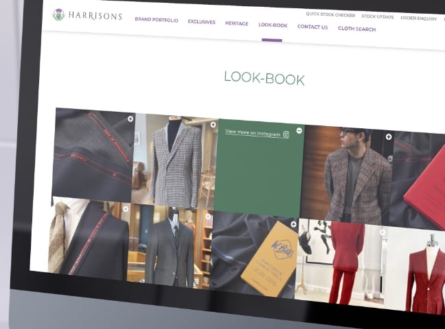
We started by updating Harrisons’ logo to bring consistency and brand pride to the website – as well as changing the URL to harrisons1863.com. A small, yet powerful tweak that would help tell the brand’s story to visitors right from the very first click. The site was given a bespoke, premium redesign with a luxe look and feel to better showcase the six high quality sub-brands in the portfolio. We remapped the layout to best showcase Harrisons’ heritage and introduced a live Instagram feed with integrated links to specific products, brand or collection pages.
A super speedy content management system was plugged into the platform meaning higher quality imagery could now be showcased across the site. It also meant these images could be updated easily – including banners and hero images.
Tailored for each and every visitor
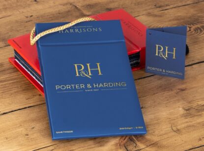
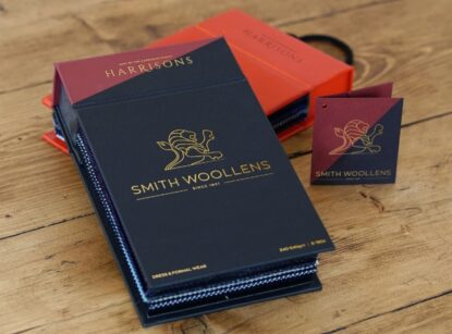
The site was redeveloped so it now effortlessly linked outside platforms to the site (like stock control systems and data feeds). This meant site visitors could now view the brands, collections and cloth detail pages, as well as place orders and see stock updates, all in one place.
We also redesigned the product search with specific detailed filters and reworked the navigation so visitors can clearly see where they need to get to. Using the latest tech, we increased the overall speed of the site and set up analytics to track visitors’ movements, measuring how well the site was doing.


